

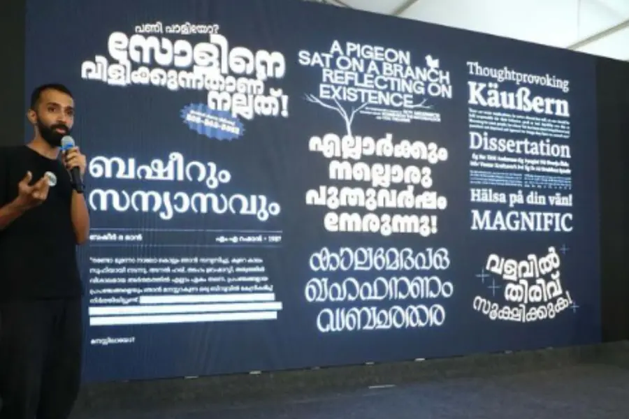
In the first edition of a two-part interview, noted typo artists Rajeesh and Athul spoke to Mathrubhumi about their journey into the world of traditional calligraphy, their experiences and the challenges they face as part of their artistic endeavours.
In part two, they delve deeper into their sources of inspiration, discuss the role of feedback in their creative process, and share insights into their innovative contributions to Malayalam typography and digital tools.
Here are edited excerpts from our conversation with them.
Where do you draw your inspiration from in your work? How do you look at feedback?
Athul: It depends on the specific project at hand. For example, the display typeface I showcased in the talk was designed for larger text, and the inspiration came from various sources—even things that weren't letters. You might draw inspiration from a sofa, and create a letterform that feels blocky and chunky. I often collect pictures of different letters whenever I travel, filling up my phone with visual references that I later use for inspiration.
Whenever I travel, my phone fills up with pictures of different letters because I find inspiration everywhere. However, when designing a text typeface, the approach is more about research and study. You can't just take inspiration from a single source; you need to look at what others have done to understand how you can differentiate your work.
As for feedback, I gather it from a range of people. In my studio, there’s a diverse group of designers from various regions of India who specialise in different scripts. Their expertise and experience with these scripts are incredibly valuable, and they form my first circle of feedback.
I also take feedback from professionals like Santhosh at SMC. While we don’t always implement their suggestions exactly as given, we give serious consideration to their points. Their feedback helps us explore different avenues and opens up new possibilities for our work.
Rajeesh, you have developed a software tool for font building. Could you provide more details about its features and purpose? How is it
Rajeesh: The tool I demonstrated here was born out of the need to manage a complex font-building project. It all started when I came across the Rachana Akshara Vedi, founded by R. Chithrajan, K.H. Hussain et al in 1999. Hussain wasn't a technologist; he was a library scientist with a deep love for his mother tongue and its script. He meticulously drew all 950 characters one by one using software called Fontographer and managed them by adding shaping rules. Rachana was later released as a Unicode Malayalam font in 2004 by Richard Stallman, the president of the Free Software Foundation.
By 2006, as more Malayalam content became available online, I noticed that these characters had some shaping problems that I mentioned earlier. We began working on fixing these issues within the font file, which contained all the characters. The subsequent fonts Hussain developed, such as Meera, were adopted in government documents and followed a similar approach.
I was in touch with Hussain because of my work fixing these fonts. It had long been his dream to digitize Bhattathiri's writings as a font for preservation and future generations. In 2017, when I returned to work in this area, I had the opportunity to meet both Bhattathiri and Hussain. They were planning to design a new font called Sundar, which Bhattathiri initially drew by hand. A team later converted it into vector format, and I added the shaping rules to complete the font, we created two more fonts designed by Bhattahiri.
The process was challenging. Bhattathiri, as a designer, would draw and digitize the characters, then pass them to a type designer like Hussain, who would place the characters in the correct Unicode slots and prepare the font. He’d also need to check the metrics for accuracy. If Bhattathiri needed to make corrections, Hussain had to adjust all the associated files, which could take six months to a year to finalize the production.
We did release a couple of fonts using this method. Around that same time, I collaborated with the Sayahna Foundation, a nonprofit organization known for beautifully typesetting classical Malayalam texts. I worked on improving Rachana by adding missing punctuation marks for typesetting, such as inverted quotes and paragraph symbols, because I wanted to use them in my work and noticed Sayahna had similar needs.
I reached out to them to explore a productive collaboration. C. V. Radhakrishnan was also interested, and we were further inspired by renowned Stanford professor Donald Knuth, who created TeX and MetaFont. We had the idea of using MetaFont to create a Malayalam font, a concept that had been attempted years earlier by a Dutch programmer, though only for a reformed script. Our goal was to apply this idea to a different approach—creating a serif font suitable for body text typesetting.
The challenge with MetaFont, however, was that its native output was in bitmap format, which wasn’t suitable for modern font formats. But John Hobby, one of the PhD students working on it, extended MetaFont with MetaPost, which generates PostScript output in vector format.
So, we created all the characters as a separate SVG files. The next step was to integrate this file into the font. To automate this process, I started writing a program using open-source software called FontForge, which has bindings for programming languages like Python. This allowed us to automate many tasks.
As a programmer, I didn’t want to manually place 900 characters into the font. Instead, I focused on automating repetitive tasks. I wrote a program that automatically sorts all the characters into the correct Unicode slots, ingests our shaping rules, and produces a fully functional font in various formats, including OpenType (OTF), TrueType (TTF), and web font formats. This workflow inspired me to apply the same approach to Bhattathiri’s designs.
Now, if every character is drawn to align perfectly at the baseline, in just two minutes, we can create a final font. This streamlined the process significantly for the designer, allowing them to iterate as many times as needed without getting stuck working all day on repetitive tasks.
Athul, you’ve designed numerous title sequences for films. Do you have access to the plot beforehand? How do you incorporate feedback into your designs?
Athul: I’ve worked on designing title sequences, though these projects don’t specifically involve calligraphy. Instead, I focus on animating the title designs. For example, in Thallumaala, I created the chapter titles—there are nine of them, each with a unique typography. I handled the lettering and animation, but it was very much a team effort. Other people also contributed to the animation, which made the project collaborative.
As for access to the plot, yes, for Thallumaala, I got to see the first cut of the film in 2021, ahead of its release the following year. However, the final cut that was shown in theatres was different from the version I initially viewed. In some cases, we don’t get to see the film; instead, we receive a brief script that helps us understand the story and the visual elements needed. We then design the titles accordingly, keeping the story and visuals in mind.
Is there a particular piece of work that you feel especially proud of?
Athul: Well, the font I showed today is called Natak. It hasn't been released yet, and while I do like the font, I wouldn't feel truly proud until one of my typefaces is released as an open-source font. I enjoy drawing type, but I don't have any particular favourites among my own works.
Rajeesh: I should say yes, especially in the context of the shaping rules we had for traditional Malayalam fonts, particularly open-source fonts. I believe open-source fonts are the ones that truly reflect traditional scripts. The existing shaping rules for Malayalam had several issues, and we worked hard to fix them. A lot of the work I did at Swathanthra Malayalam Computing (SMC) helped achieve about 99% accuracy, but there was always that remaining 1% that presented problems.
In 2019, I collaborated with the Rachana Institute of Typography, a volunteer organization that included Hussain and C. V. Radhakrishnan. A few of us, including Bhattathiri, realized that we needed a fresh approach. Hussain often received complaints about certain character combinations, as he was the public face of our work, and it made him unhappy.
That’s when I had a realization: our approach was inverted. As Carl Gustav Jacob Jacobi famously said, "Invert, always invert." I decided to rewrite all the Malayalam shaping rules from scratch, and that fixed all the known shaping problems once and for all.
It took me 15 years of experience to get to the point where I could write those rules, but once I set my mind to it, I completed the rewrite in just four or five days. While I wouldn't say I'm proud of it, I am certainly very happy and satisfied with the results. And the best part is that this work has been released as open source, so it's available for any Malayalam font to use.
Not only that, but Hussain also developed a naming convention for the characters, which has made programming and writing shaping rules much easier. Without this convention, everyone would have to remember the Unicode code points for each character, which is a huge challenge.
Have you ever experienced a moment where someone praised your work without knowing it was yours? How did that feel?
Rajeesh: My work is mostly on the backend, so it’s not something people typically notice. However, shortly after we released the new shaping rule, we discovered it still had a few issues. This means that while it included all the characters, Bhattathiri's fonts are display-style fonts, usually limited to around 750 or 700 characters. The challenge here is that I had a shaping rule written for 900+ characters. If I wanted to apply this rule to a font with a smaller character set, I would first need to remove the unnecessary rules that apply to the characters not included in that set.
For font building, we used FontForge, an open-source font project. The advantage of open-source software is that I can access its source code and compare it to something like Adobe InDesign, where you can never access the source code. FontForge is a very complex program, with hundreds of thousands of lines of code, but I was able to adapt it to work with these definitive shaping rules. This means you can have a font with 900 characters, but if you’re working with a font that only has 700 characters, the shaping rule still works, ignoring the non-existent glyphs.
The beauty of this system is that it can be used for any language, not just Malayalam. Latin, for example, can also apply this. I submitted my changes to the upstream project, and they reviewed it, accepted it, and merged it into the code, and it was eventually released.
I also wrote a technical blog about this work, which was widely circulated. The only feedback I received came from Nathan Willis, who is part of the HarfBuzz project and maintains the documentation for the OpenType specification. He recognized the value of this work, noting that it added reusability for all Indic languages and other scripts like Latin. His comment really meant a lot to me—it felt good to know that someone recognized the effort.
That was one instance of recognition. The second one wasn’t directly my work, but it’s a story I always find inspiring. Back in 2013, there was a shaping issue with Malayalam subtitles in VLC. The problem was that while subtitles in English and Latin worked perfectly, Malayalam subtitles had issues. A teenager, or perhaps a recent graduate from Syria, learned C programming and started looking into the source code of VLC, which is made up of millions of lines of code. He integrated HarfBuzz into the shaping part, fixing the Malayalam subtitle issue.
But here’s the kicker: just before he finished everything, he disappeared for a week. When he returned, he explained, "Sorry for the delay. We were getting continuously bombed in Syria while I was working, and we didn’t have internet access." It’s incredible that someone in such dire circumstances was still able to contribute to the open-source community.
Now, this fix needs to be tested. This was back when Google Plus was still active, and there was a large Malayalam community there. I was a part of it, and so was Jean-Baptiste Kempf, the lead developer of VLC. He had posted a request asking if anyone could test the new Malayalam subtitles fix. So, I created a small subtitle file in Malayalam and sent it over to him for testing. He suggested we also try testing it with the nightly builds, so I built it from source on Linux and tested it, and everything worked fine for Windows too.
Everyone was happy with the results. A few months later, I was in Belgium at FOSDEM, a major European event centred around free and open-source software development. Jean-Baptiste was presenting a talk there, and during his presentation, he showcased the Malayalam subtitles I had tested. I was really surprised and touched to see that, even though it wasn’t my direct work, the Malayalam language was represented in front of such a large community of software developers.
After the talk, I went to meet Jean-Baptiste, and we had a chat about the Syrian developer and everything that had happened. It was a heartwarming experience to see how the global open-source community came together to solve this problem, and how Malayalam was represented in such a large forum.
When it comes to designing, do you prefer working on paper or software? Which do you find simpler, considering the complexities of the art?
Athul: I prefer starting with a traditional medium. For me, that means either drawing in a book or using my iPad—though the iPad isn't exactly a traditional medium. I still consider it "traditional" in the sense that I use a pencil, or rather, an Apple Pencil, on the screen to draw, which feels more natural to me. So, I usually start with paper or the iPad for the initial sketches.
Once I’ve worked out everything in the sketch itself, then I move on to digitizing the design. If you start by drawing digitally from the very beginning, it can lead to a lot of iterations in the process. I do draw digitally sometimes, but I find it useful to get the sketch down first. When you're sketching traditionally, you have the freedom to try out many variations quickly. For instance, if you draw a stroke and it doesn’t work, you can just chuck it and try again, which gives you more flexibility to experiment. I think it’s just a matter of personal preference.
Published: 09 Nov 2024, 11:29 am IST
ABOUT THE AUTHOR
Disclaimer: Kindly avoid objectionable, derogatory, unlawful and lewd comments, while responding to reports. Such comments are punishable under cyber laws. Please keep away from personal attacks. The opinions expressed here are the personal opinions of readers and not that of Mathrubhumi.