Instagram gets a new wordmark after 10 years, sparking ‘instagzam’ jokes online
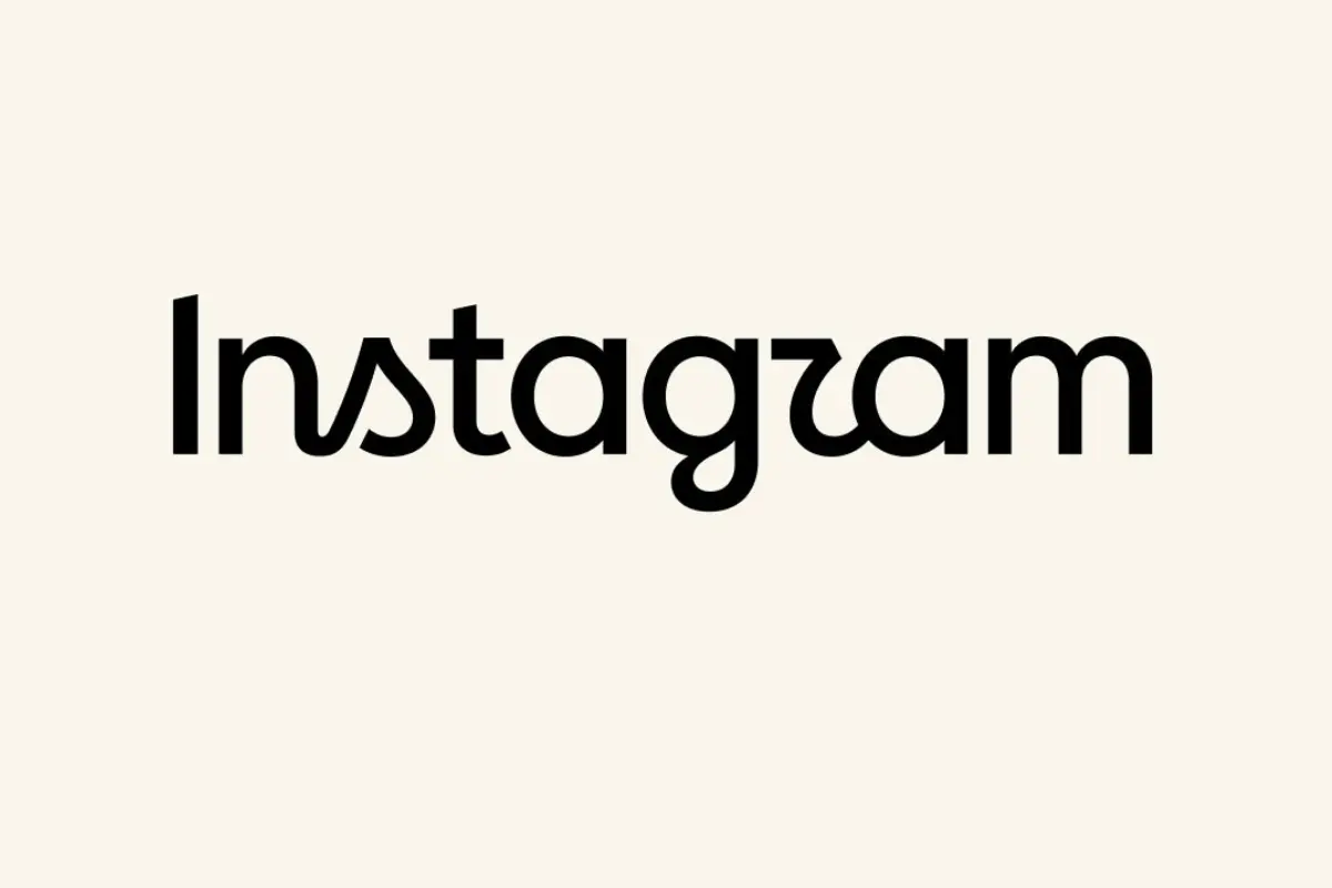
New Delhi: Instagram has given its wordmark a subtle but notable makeover, marking the first update to the text-based logo in nearly a decade. The refreshed design keeps the platform’s familiar script style but redraws its letterforms for what Instagram says is a “sharper, more modern” appearance.
Instagram head Adam Mosseri announced the change on Instagram and Threads, saying the previous wordmark had remained unchanged for 10 years and was due for a refresh. He described the new design as cleaner and more modern while retaining references to Instagram’s original identity and its emphasis on simplicity and craftsmanship.
A small change with a big branding question
Unlike a complete logo overhaul, the latest update is focused specifically on the wordmark-the text spelling out “Instagram”. The familiar cursive-inspired aesthetic remains, but several letters have been redrawn, giving the name a noticeably different appearance.
The redesign has already divided users. While some have praised the fresher look and typography, others have poked fun at the shape of the letters, with some joking that the redesigned “r” makes the name look like “Instagzam”.
The typography also brings back elements associated with cursive handwriting, particularly in letters such as “s”, “r” and “g”. That stylistic choice has itself drawn attention, especially as cursive writing has become less familiar to younger generations.
Instagram’s last major visual change was in 2016
The wordmark refresh comes 10 years after Instagram’s last major visual identity update. In 2016, the platform replaced its original brown camera logo with the colourful pink-gradient icon that remains in use today.
For now, the change appears limited to the wordmark. Meta has not indicated whether the redesign will be followed by changes to Instagram’s app icon or a broader visual overhaul.
The update may be small, but the reaction highlights how closely users associate even minor typography changes with a familiar digital brand. After a decade with virtually the same wordmark, Instagram’s latest tweak is proving that changing a few letters can be enough to get millions of people talking.